Saturday, April 26, 2008

Blog Entry #4


1.       How has this work contributed a new or different understanding of color to the world?

HISTORY OF ART

This work laid down the foundation for all color schemes to come.  It is why we have some of the color schemes we do today.

FASHION DESIGN

Designing helps us understand color because with clothes you can mix and match colors that you never thought would match.  Also it helps people create new and trendy color schemes.

VISUAL CULTURE

Visual culture images help people see the more urban color schemes.  Most people just see them as regular colors but when you arrange them in different orders you can get new and different colors.


2.       What visual phenomenon or color principles make it stand out among works in the same medium or genre?

HISTORY OF ART

With historical arts you can really point them out easily because of the horizontal and vertical line use.  Also, the perspective in which they paint it from is very commonly seen.

FASHION DESIGN

In design art they can use patters such as plaid, to mix and match colors. Thus, making them stand out more.

VISUAL CULTURE

The medium used in visual culture art is really what makes it stand out.  Once you see a visual culture piece you know that’s what you’re looking at.


4.       How have they used dominance to organize or structure their work?

HISTORY OF ART

The bigger images are in the foreground of the picture making them the more dominate image.

FASHION DESIGN

In fashion design they establish dominance by using more of a certain color.

VISUAL CULTURE

Cultural pieces tend to over dramatize the dominate structure in their image.


5.      How do they address the human form (in the picture or in relation to it)?

HISTORY OF ART

In historical art the human body is represented in a very formal way.  From time to time you will see a nude person but they are displayed very elegantly.

FASHION DESIGN

Mainly people are portrayed as fake because they are trying to create clothes.  They are not worried about how realistic the person looks.

VISUAL CULTURE

The human body is either seen in its actual form or is a picture.  Overall the human body is rendered very realistically.


6.       In what ways have you been influenced after seeing this work?

HISTORY OF ART

Create new compositors that are realistic.

FASHION DESIGN

Try to test out new color schemes

VISUAL CULTURE

Not be afraid to try new things.

Monday, April 21, 2008

Image Essay #10


The black and white media used to create this image is gives the picture a lot more emotion and makes that clear to viewer. Also, the way she is positioned on the chair, with her head down, helps convey the depressing emotion the artist is trying to get across. There is a nice use of tenebrism as you can see there is a strong directional lighting, moving from right to left. You can see excellent use of chiaroscuro that is used to define the figures body, creating definition in the person’s body structure. The hair is rendered very well, you almost can see the blondness in here hair, even though the picture is in black and white. Although this image is a little boring you can tell that the artist took there time. Over all this is a well composed composition with crisp lines and a good use of shading.

Image Essay #9


This painting possesses many of the color properties. There are four main color properties over all, dominance, temperature, color symbolism, emotion and this image has them all. The dominate color is obvious in this image, the black trees, they seem swamp like. The trees get smaller as they go back. Creating the illusion of space, making the trees appear as if they are far away to the audience. At first this image looks to be a cold and musty picture. Then you see the faint red be hind the trees and notice that they may look like they are on fire instituting a hot temperature because red is known to be a hot color. The color symbolism would be evil, creepy, and eerie, which is evident right away. Emotion was defiantly a big reason behind the creation of this image. There is an angry emotion that goes with this painting, giving it great pop making it such an amazing image.

Image Essay #8


This image was composed by Mark Tansy a very well known artist. He is known for his monochromatic images. This is a monochromatic image done with shades of blue. The image is that of the Wright brothers testing there plane designs. The only difference is Tansy decides to use his artistic freedom and make the plane a little more inventive. It looks like a flying creature of some sorts. The hills fade from dark to light creating the illusion of space. Notice one other thing; there is a paint bucket and a little stool in the bottom left hand corner of the image. The seat could be were the Tansy say to paint the flying creature. On the other hand, the seat could be for you, the artist. As if he were saying u can paint what ever u can imagine. Giving u artistic freedom to change plane into what ever you desire it to be.

Sunday, April 6, 2008

Blog Entry #3

1. Do we define a place or does a place define us?
A place is defined by the way an individual artist renders it to be. An artist can make a happy place like cedar point with lots of little children riding rides and smiling. Or the artist can take Cedar Point and make it a horrific image by creating a image of a rollercoaster derailing and depict the deathly scared faces of the people riding the ride. The artist defines how we view the place.

2. How is each of the featured artists influenced by particular places? How is this influence reflected in the artist’s work?
Each artist is influenced by in which manor they were raised in. for example artist Do-Ho Shu’s art is very reflective of his Chinese background.

3. Which artist do you feel most connected to and why?
Richard Serra, because he has found a way to make a living out art, and that inspires me to try and do what he has done. Being an artist is no easy task for one person to handle, and having to make a career out of it is even harder.

4. When you were young, was there a place that interested you? A place that scared you? List five places from your childhood. Use one word to describe each of them.
1. Rock’n’Roll Hall of Fame
2. Space
3. Attic
4. Cellar
5. Closet

5. Pick one of those places. Try and remember it as well as you can. Answer these questions about it… What objects occupy that place? What are the textures and sizes of those objects? What was the lighting like? Was it a dark dreary place? Or a bright happy one?
Cellar
House decorations, suit cases, fans, screens, candles, boxes, dusty, moist, dark, creepy, shadows, monsters, Halloween costumes, files, water heater, sub pump, bricks, paint, stain, Christmas tree.

Thursday, April 3, 2008

Image Essay #7


This image was done by the controversially known artist, Sally Mann. Sally Mann’s pictures are known to be controversial because of the subject matter she chooses to photograph. This image is not one of her more revealing images, but I chose is because I believe is best represents her style. Which is known to be as in the moment, and that’s exactly what this picture is. The picture doesn’t look staged or choppy; the image is very crisp and elegant. The way the older girl on the left is waving her hand and the position that the little girl on the right has her hand on her hip is all very elegant and fluid. Even more elegant is the expression emulated from each of their faces. The girl on the left has a sharp, fierce gaze on her face; that is what really drew me in when I first saw this image. While also the little girl on the left seems to display more attitude on her face, almost as if she was trying to imitate her sister.

Wednesday, March 26, 2008

Texture, Symmetry and Gestalt


sorry about the quality, i took 5 pictures and this was the best one. The texture on the right side is the egal on the back of a quarter collaged together. the teeth are are cut from a tick cardboard so they pop of the page a little bit. Everything else you can pretty much see.

Monday, March 17, 2008

Image Essay #6


There are many different gestalt principals displayed in this picture. There is the repetition of a pixilated patter throughout the two figures faces, and is also continues into the background a little bit. The close proximity of the pixilated pattern really seems to hold your eye. Were I first look at this picture my eye is immediately attracted to the high and low contrast of the black in white at the top right hand corner of this image. The negative reversal of the mirror and frame, the scarf, and jacket in the back ground is a cool effect that really livens up this picture. They way they used the negative reversal on the jacket gives it a sawed looking texture to it. Overall this is a well composed image implicating many of gestalts principals throughout the whole composition, and doing a very good job of it. The picture is not boring or stagnant. It moves your eye around the picture quiet fluidly.

Monday, February 25, 2008

Blog Entry #2


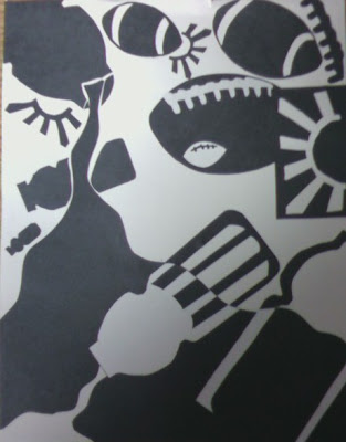
The Three elements displayed in this picture are very easy to distinguish, they are, a football, sun rays, and a Gatorade bottle. There is a dominate positive area to the right side, and a subordinate positive area on the left hand side of the image. With a dominate negative area falling through the center of the picture.
The reason I choose the football was I played football all throughout high school. Naturally it was a big part of my life. I placed the footballs in dynamic positions, even placing a smaller positive shaped football inside a bigger negative shaped football. Also, displaying the laces of the football in both a positive and negative way, at the top right hand corner of the image.
The second element I choose was the sun rays. I used that shape because I lived in California for seven years. Ever since then I have loved California and always go back as much as I can. I used the sun rays in both positive and negatives shapes, all throughout the picture. One is also juxtaposed with a football on the right hand side of the image.
The third and final element displayed in this image is a Gatorade bottle. I decided to use that object because I don’t drink soda. There for, Gatorade is one of my drinks of choice. I dynamically placed the bottles throughout the picture, one moderately sized bottle spilling liquid from the left hand corner to the right. The liquid is expanding as if it were coming towards you. Within the fluid there are two Gatorade bottles juxtaposed with in the liquid. One appears to be spilling more liquid, while the other one is an outline of the bottle.
Over all it is a decently composed image, all the elements are placed dynamically. Thus, creating an interesting image that easily catches your eye and holds your attention.

Monday, February 18, 2008

Image Essay #5


In this picture there is a lot going on. The artist does a good job of using unity with the two red faces. Also if you look at the two red faces long enough you will begin to notice that the two faces form a shape of a chalice in the background. The girl at the top of the image gives this picture a very elegant almost sleepy look to it. The soft features in her face, the red lingerie and the lacy black dress are what give it this feeling. Also the smoky like texture used on the background, and the grouping of the pictures contribute to this feeling greatly. The three main figures have sort of a triangular positioning, and then which draws your eye in to see the blue chalice. The blue chalice in the background really contains your eye and keeps it from flowing right off the page.

Sunday, February 3, 2008

image essay #4


The artist in this piece does a nice job of using the gray scale throughout the picture. They also do a good job of using perspective, the buildings are positioned in a way that make them appear to be towering over the plane. The way that the plane is positioned is very dynamic, also the line definition in the plane is very intricate and gives the plane an old, kind of moldy look to it. The way the clouds are created with the gray scale makes them seem so much more real, as if I were to actually be looking at the night sky. The clouds are also in a spiral pattern and gives them a swirly appearance. Which create a focal point in the center and that is the bright white moon that you see. Oval this is awesome picture I really like it, it reminds me of the matrix and how things are in the “Real World”.

Sunday, January 27, 2008

Image Essay #3


The artist who created this piece did a good job of balancing the tension between the life like tree in the center and the cartoon like stars and clouds around the outside of picture. They also did a good job of using figure ground reversal with the globe in the center. The fact that this piece is in black and white really brings the picture together. Because if the picture were to be created in color the tree and world in the middle would not seem so creepy and eerie, thus not holding your eye to the point of focus. Also, since the artist did put the tree in bigger perspective it creates a bigger area of focus and gives the artist more room to create the texture on the tree. Although, the tree is posted in the center of the picture which makes the picture become stagnant, if the artist were to make the area of focus of center it might hold your eye longer.

Wednesday, January 23, 2008

image essay #2

This drawing is a replica of M.C. Escher’s famous eye drawing. In this picture they do a good job of using the gray scale. They also do an excellent job of balancing positive and negative space around the eye, which really holds your eye to the center of the drawing. Thus makes you focus on the skull reflecting in the center of the eye. The glair in the left corner of the eye makes your eye move around the picture and keeps the picture from being stagnant. The texture in the eyelashes and in the right corner of the eye makes the picture feel more lifelike. Then your eye begins to wander downward towards the bottom of the page and you begin to see the upper part of the cheek. But the skin is not that of a real person, the skin seems to be flaky and dissipating. As if it was to be the skin of a real dead person.

Sunday, January 13, 2008

Blog Entry #1

I first started drawing when I was just a little kid, like everyone else did. It wasn’t until I got to high school when I really realized that I liked to draw. Not only did I like to draw, I was actually good at it. My favorite materials to use are just a regular piece of paper and a pencil. I think I favor the drawing media more because it was what I first started with, and it is what I am most comfortable using. Since I have gotten to college I have really broaden my use of different media’s. School honestly inspires me the most. This is because when I was in high school during class was when I would always draw the most. To me art is the use of any media, and sometimes the combination of different media’s. One of the reasons I chose to pursue art academically is because when I grow up I want to be able to do something that I love to do. Naturally that is art for me.

Saturday, January 12, 2008

image essay #1


In this picture the sun reflecting of the through the wine bottle, and the glass really captures your eyes right away. There is a dominate background area at the top of the picture, were the darker clouds are located at the top of the page. The picture also has a subordinate background area located between the wine glass and the bottle in the middle of the picture. There is also an accentual background area located just to the left of the wine glass. The wine bottle at the left of the picture would be considered the dominate object. The glass on the left would be subordinate, in turn making the sun that shines through the wine glass accentual. The picture was take very proportionately. This picture is a great example of what we have been working on in class and demonstrates the limited vocabulary we have been introduced to in our beginning classes.