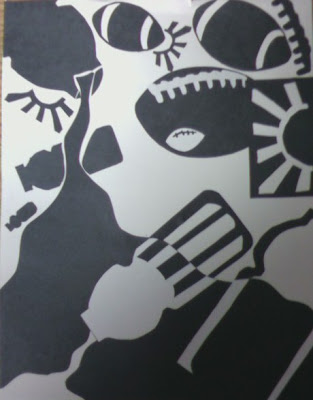
The Three elements displayed in this picture are very easy to distinguish, they are, a football, sun rays, and a Gatorade bottle. There is a dominate positive area to the right side, and a subordinate positive area on the left hand side of the image. With a dominate negative area falling through the center of the picture.
The reason I choose the football was I played football all throughout high school. Naturally it was a big part of my life. I placed the footballs in dynamic positions, even placing a smaller positive shaped football inside a bigger negative shaped football. Also, displaying the laces of the football in both a positive and negative way, at the top right hand corner of the image.
The second element I choose was the sun rays. I used that shape because I lived in California for seven years. Ever since then I have loved California and always go back as much as I can. I used the sun rays in both positive and negatives shapes, all throughout the picture. One is also juxtaposed with a football on the right hand side of the image.
The third and final element displayed in this image is a Gatorade bottle. I decided to use that object because I don’t drink soda. There for, Gatorade is one of my drinks of choice. I dynamically placed the bottles throughout the picture, one moderately sized bottle spilling liquid from the left hand corner to the right. The liquid is expanding as if it were coming towards you. Within the fluid there are two Gatorade bottles juxtaposed with in the liquid. One appears to be spilling more liquid, while the other one is an outline of the bottle.
Over all it is a decently composed image, all the elements are placed dynamically. Thus, creating an interesting image that easily catches your eye and holds your attention.

